DESIGN A VISUAL TO MATCH
AN EXCEPTIONAL PRODUCT
CLIENT
SIBOIRE MICROBRASSERIE
SERVICES
PACKAGING
MOTION DESIGN
CHALLENGE
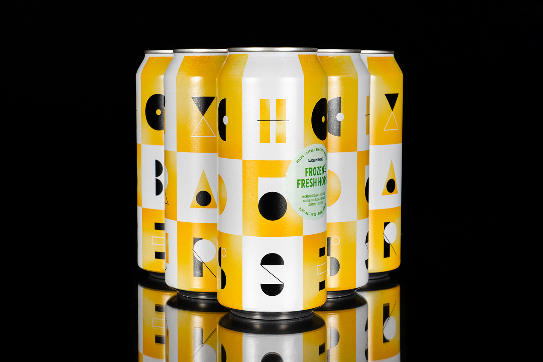
For a few months now, we have been working on several projects with the beautiful team of Siboire Microbrasserie. Always evolving, they approached us to create the visual universe of their new family of exclusive and limited products: Choix du brasseur (Brewer’s Choice). The main challenge was to think about a visual strategy so that this product stands out from the competition without distorting the family of products already set up by the microbrewery.
For a few months now, we have been working on several projects with the beautiful team of Siboire Microbrasserie. Always evolving, they approached us to create the visual universe of their new family of exclusive and limited products: Choix du brasseur (Brewer’s Choice). The main challenge was to think about a visual strategy so that this product stands out from the competition without distorting the family of products already set up by the microbrewery.
For a few months now, we have been working on several projects with the beautiful team of Siboire Microbrasserie. Always evolving, they approached us to create the visual universe of their new family of exclusive and limited products: Choix du brasseur (Brewer’s Choice). The main challenge was to think about a visual strategy so that this product stands out from the competition without distorting the family of products already set up by the microbrewery.
For a few months now, we have been working on several projects with the beautiful team of Siboire Microbrasserie. Always evolving, they approached us to create the visual universe of their new family of exclusive and limited products: Choix du brasseur (Brewer’s Choice). The main challenge was to think about a visual strategy so that this product stands out from the competition without distorting the family of products already set up by the microbrewery.
SOLUTION
SOLUTION
The graphic line created for this range of products is characterized by a surprising visual universe and a unique typographic layout. The geometrical/mechanical side of the letters parallels the brewing process and the know-how of the company while adding a touch of madness to make the can attractive and memorable.
AWARDS
APPLIED ART DESIGN 2022
SHORTLISTED AT THE DIELINE AWARDS 2022


Nous créons des projets qui sortent du cadre et collaborons avec des marques ambitieuses, ici comme ailleurs, pour donner vie à des idées audacieuses.
PARLEZ-NOUS DE VOTRE PROJET
INFO@STUDIOMILES.CA
+1 (819) 481-1246
STUDIO
ARCHIVES
SHOP
POLITIQUE DE CONFIDENTIALITÉ
TERMES ET CONDITIONS
® STUDIO MILES / TOUS DROITS RÉSERVÉS