CREATE A DIALOGUE BETWEEN
CREATOR AND PUBLIC
CREATE A DIALOGUE BETWEEN CREATOR AND PUBLIC
CREATE A DIALOGUE BETWEEN CREATOR AND PUBLIC
CREATE A DIALOGUE BETWEEN CREATOR AND PUBLIC
CLIENT
CENTRE CULTUREL DE L'UDES
SERVICES
BRANDING
MOTION DESIGN
WEB DESIGN
EDITORIAL DESIGN
CHALLENGE
The Cultural Center of the University of Sherbrooke has the Maurice O'Bready Hall, the fourth largest theater in Quebec. After several years with the same visual identity, their team has mandated us to review the full brand platform. This large-scale project aimed at redefining the brand, evolving and having a unique personality.
The Cultural Center of the University of Sherbrooke has the Maurice O'Bready Hall, the fourth largest theater in Quebec. After several years with the same visual identity, their team has mandated us to review the full brand platform. This large-scale project aimed at redefining the brand, evolving and having a unique personality.
The Cultural Center of the University of Sherbrooke has the Maurice O'Bready Hall, the fourth largest theater in Quebec. After several years with the same visual identity, their team has mandated us to review the full brand platform. This large-scale project aimed at redefining the brand, evolving and having a unique personality.
The Cultural Center of the University of Sherbrooke has the Maurice O'Bready Hall, the fourth largest theater in Quebec. After several years with the same visual identity, their team has mandated us to review the full brand platform. This large-scale project aimed at redefining the brand, evolving and having a unique personality.
SOLUTION
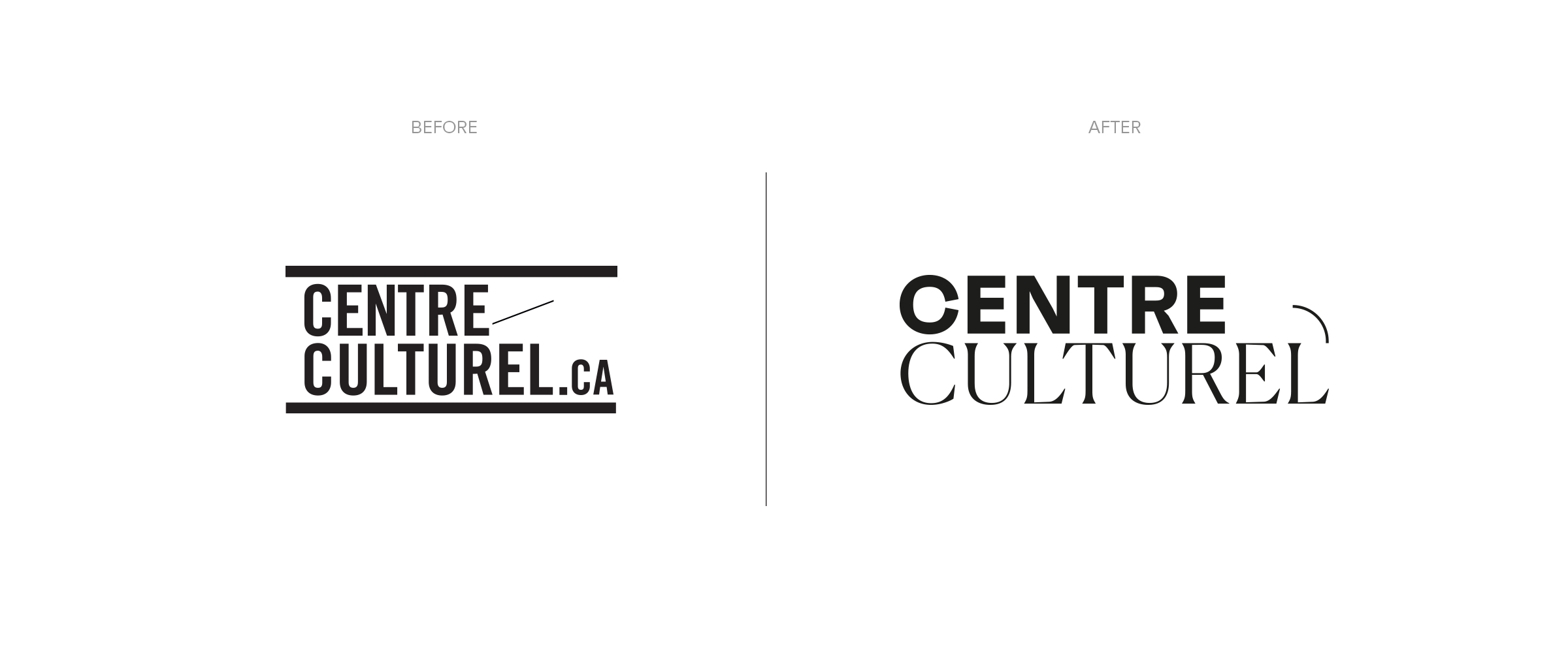
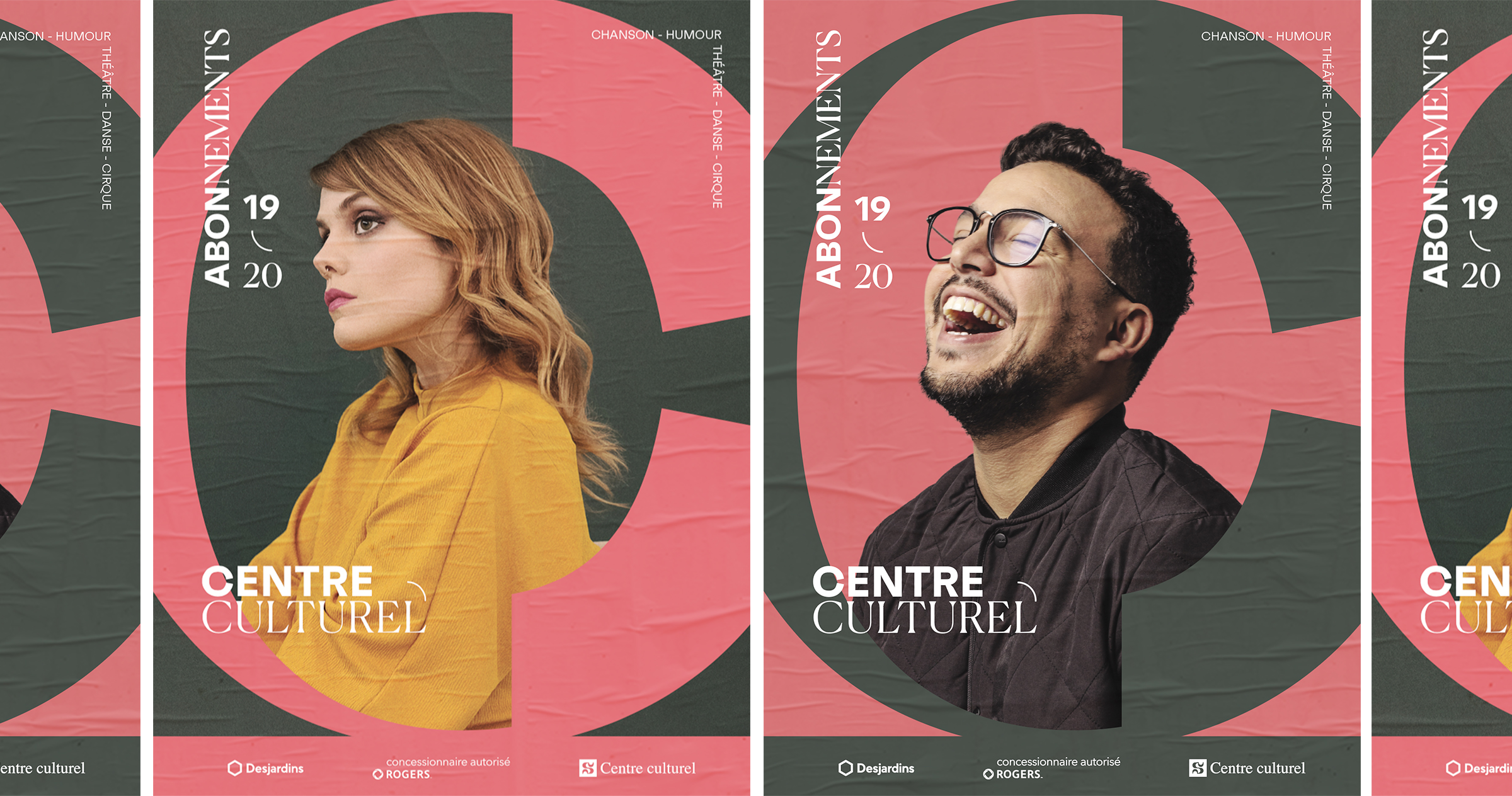
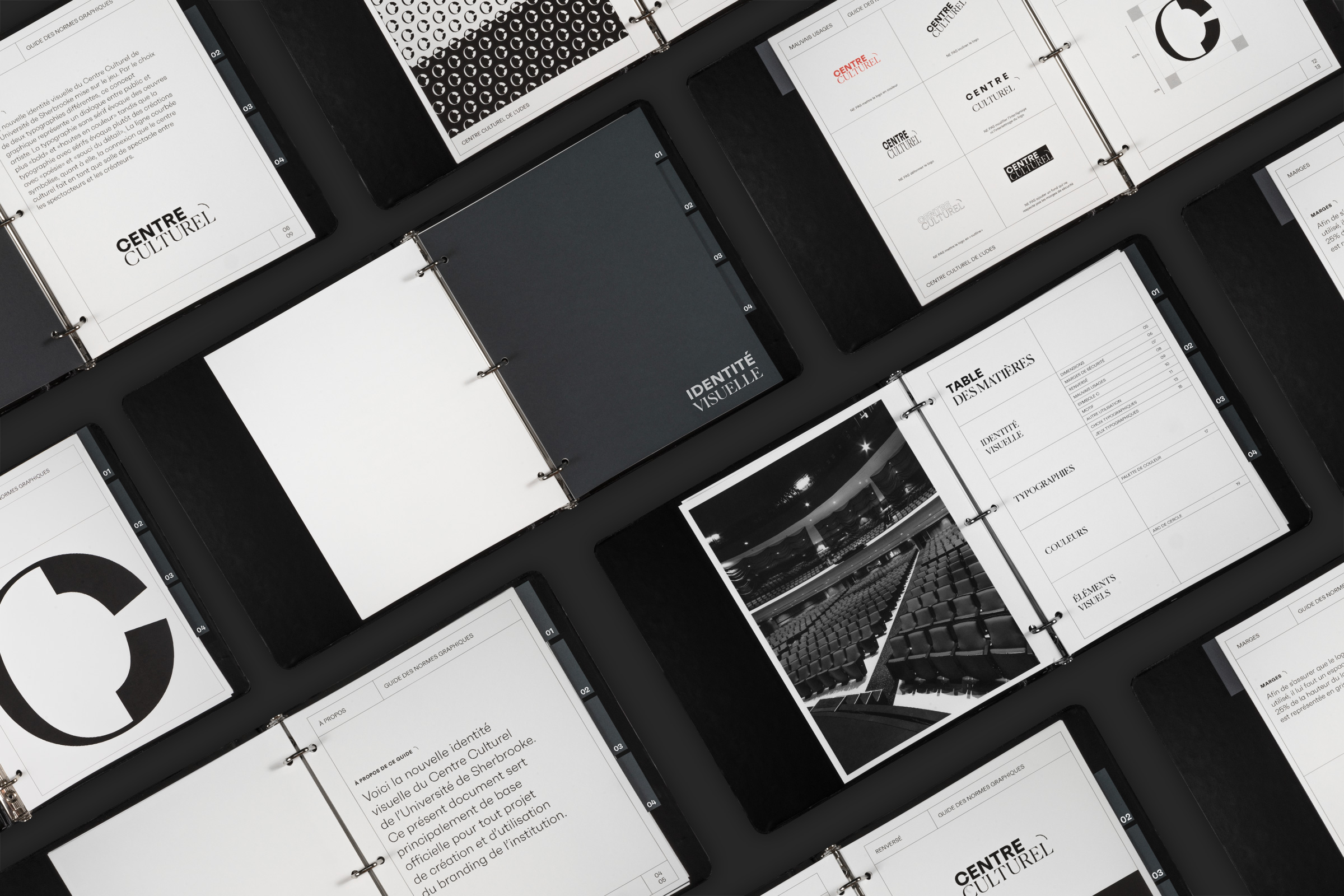
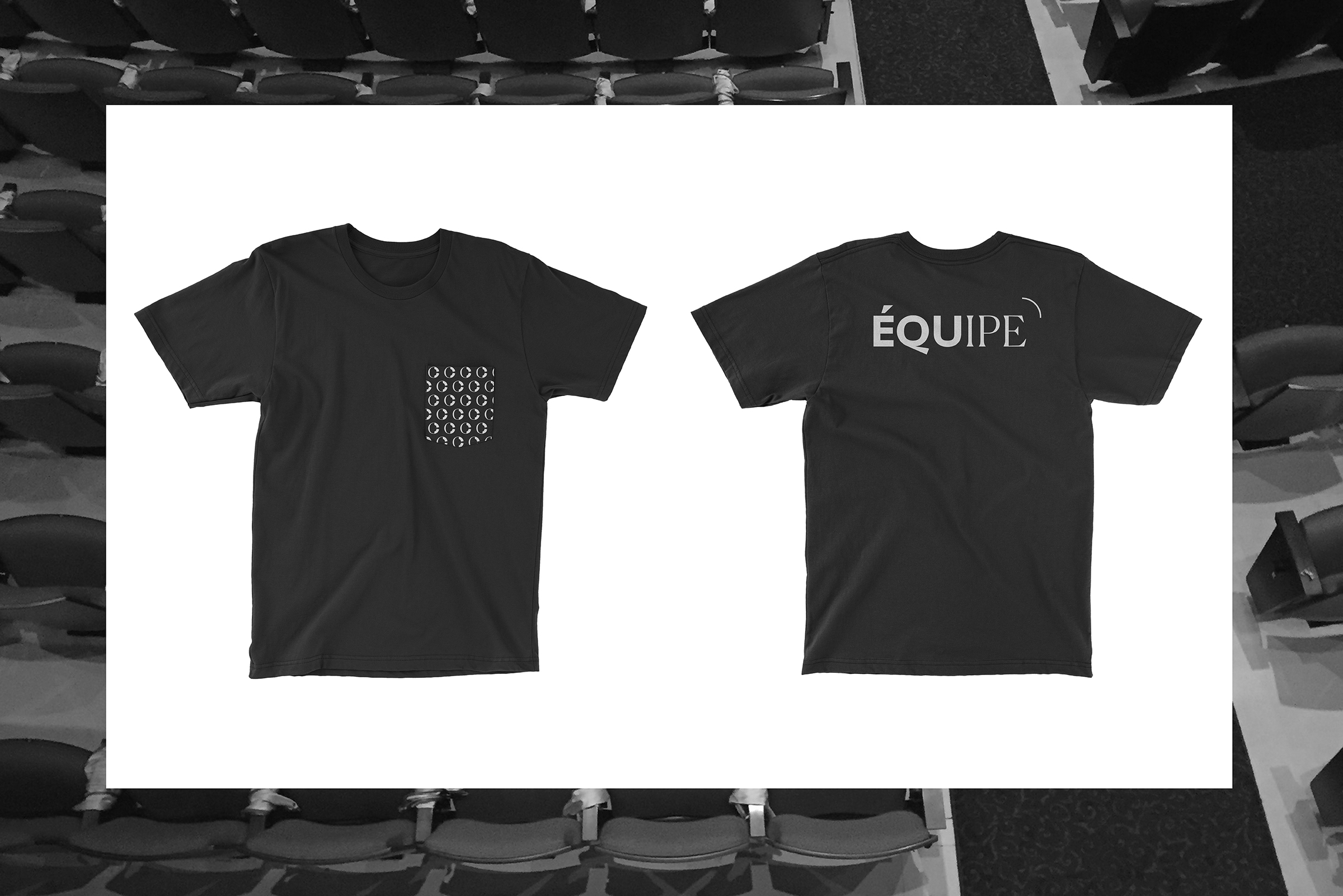
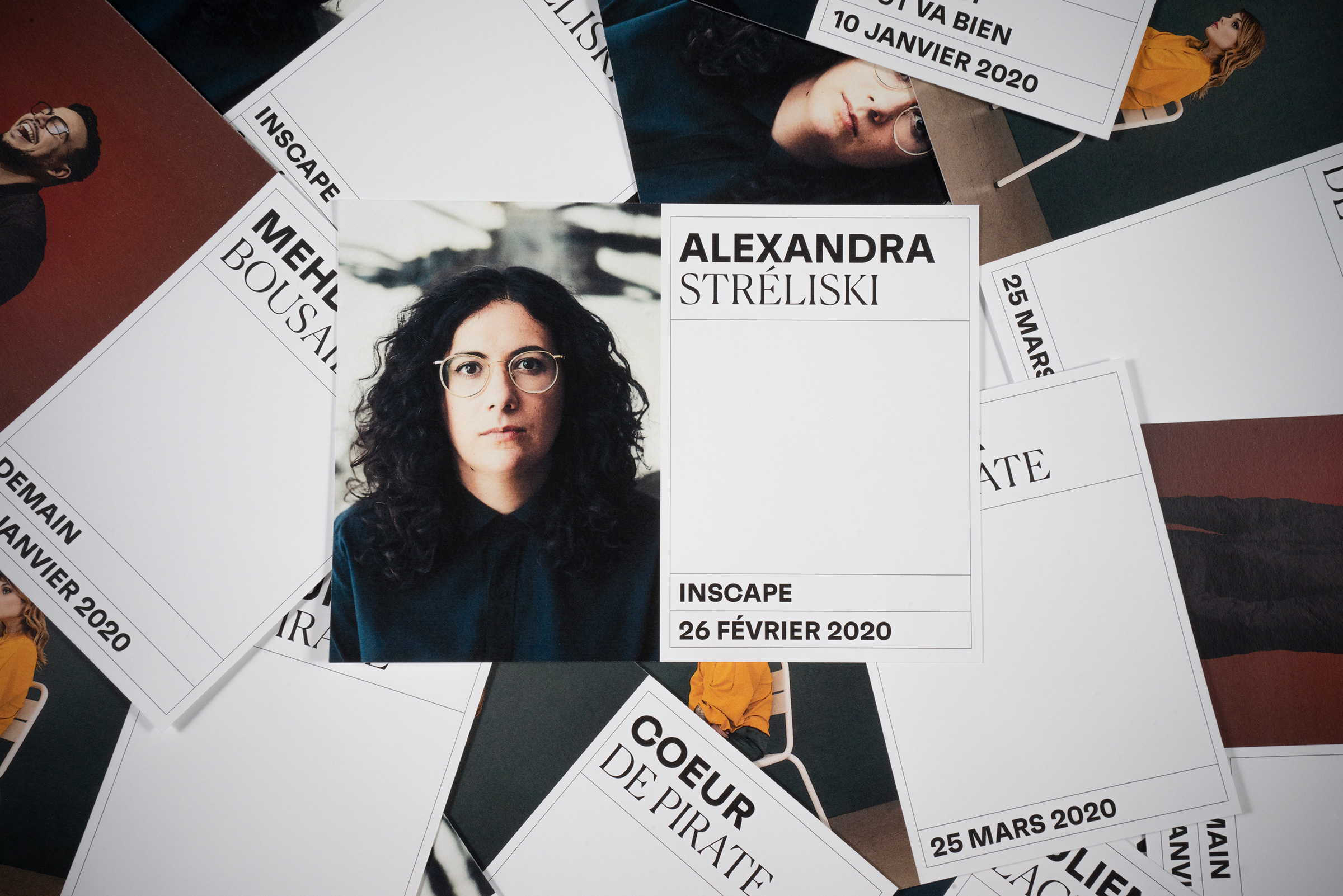
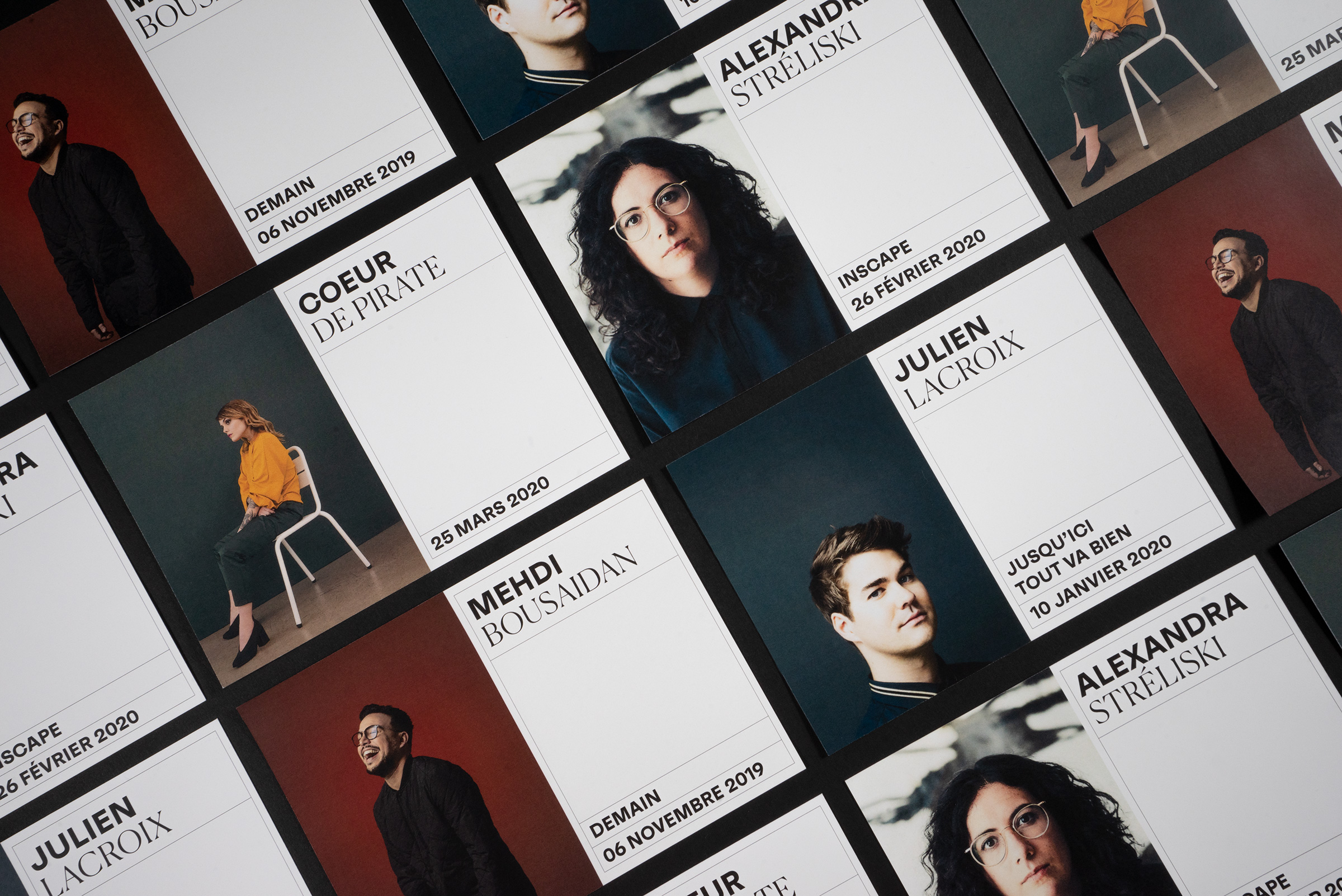
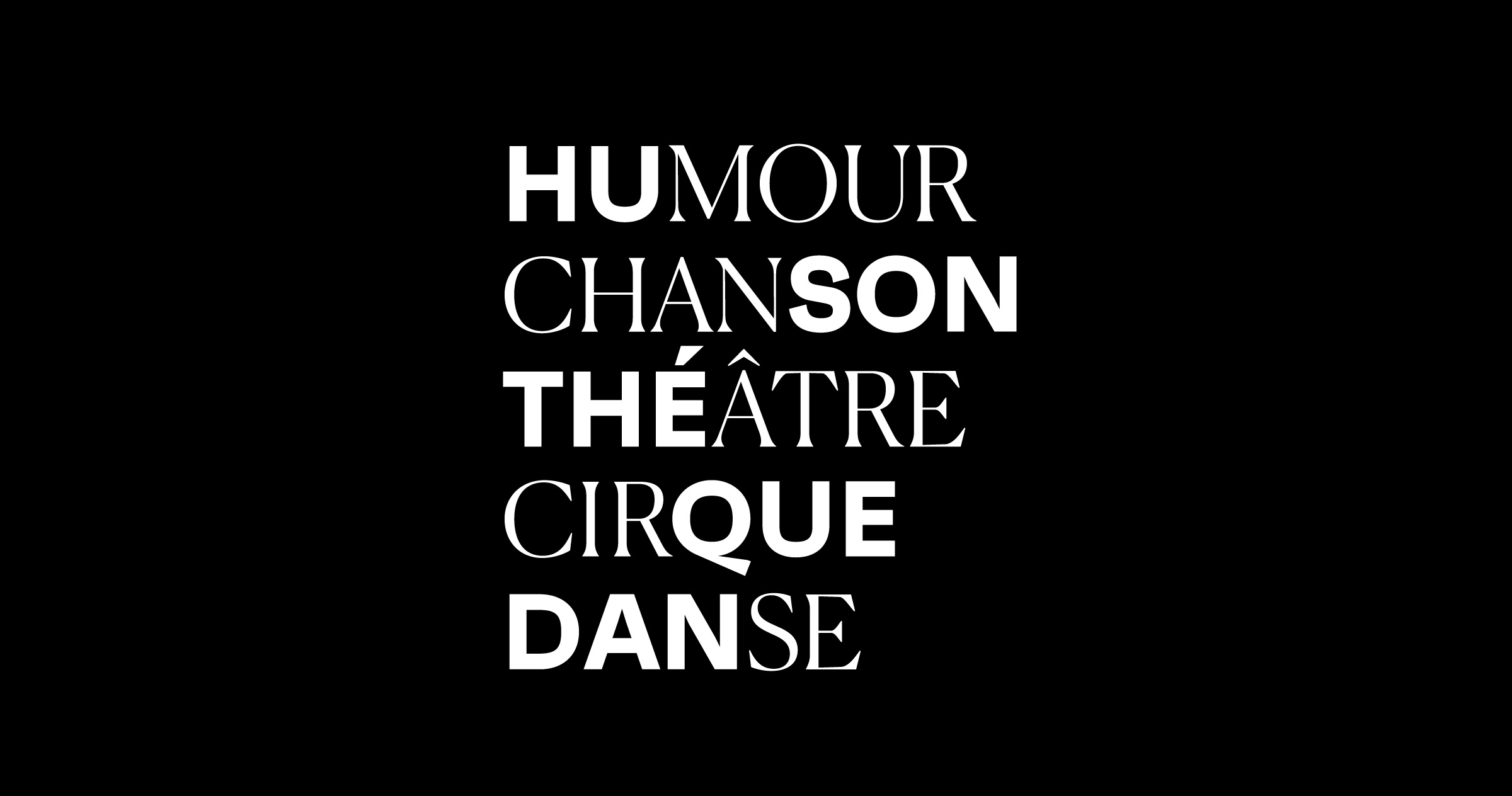
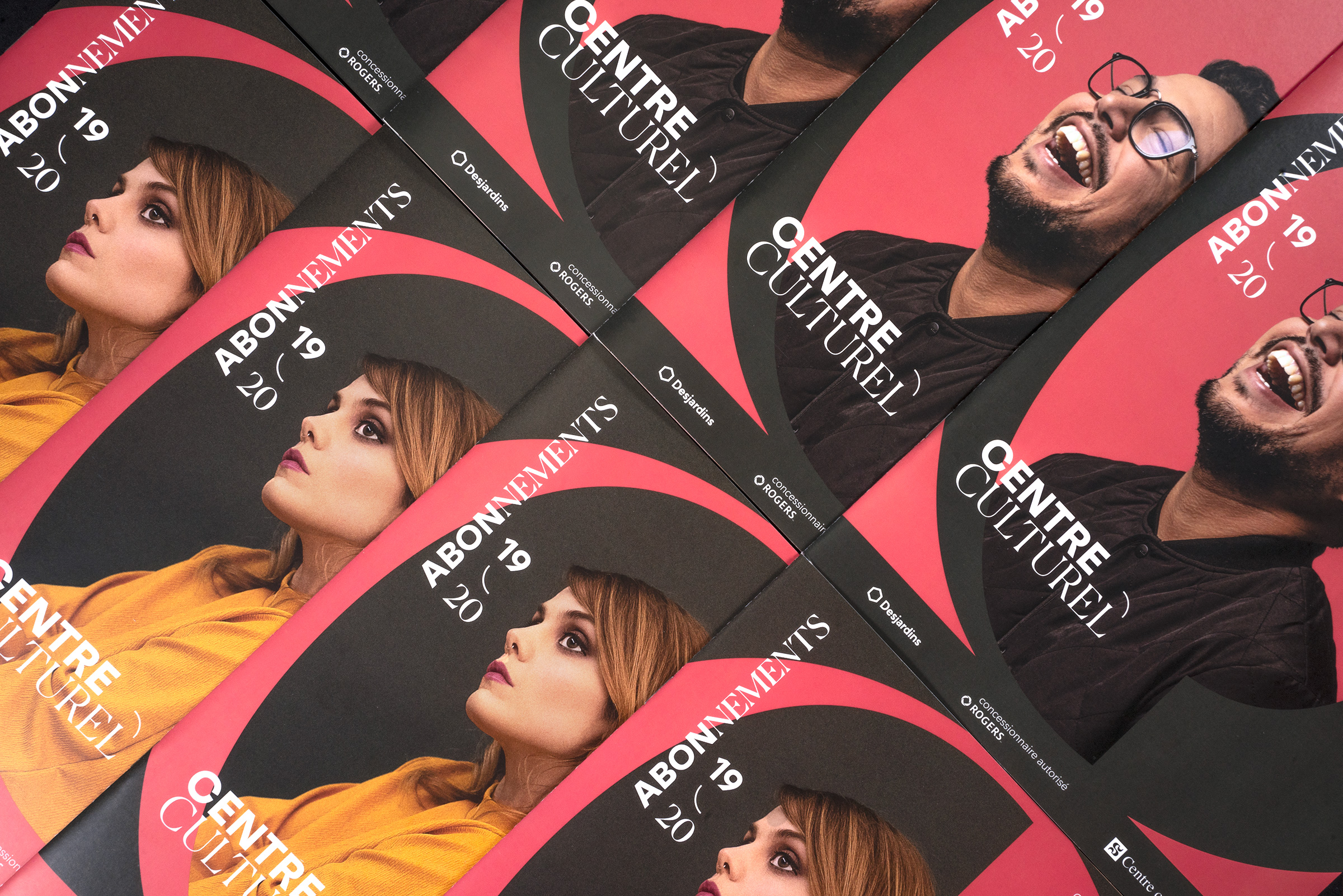
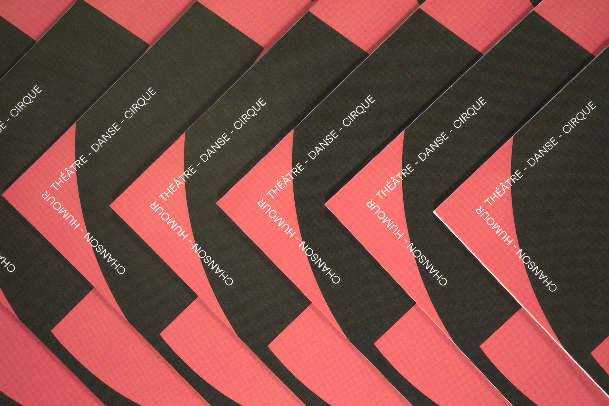
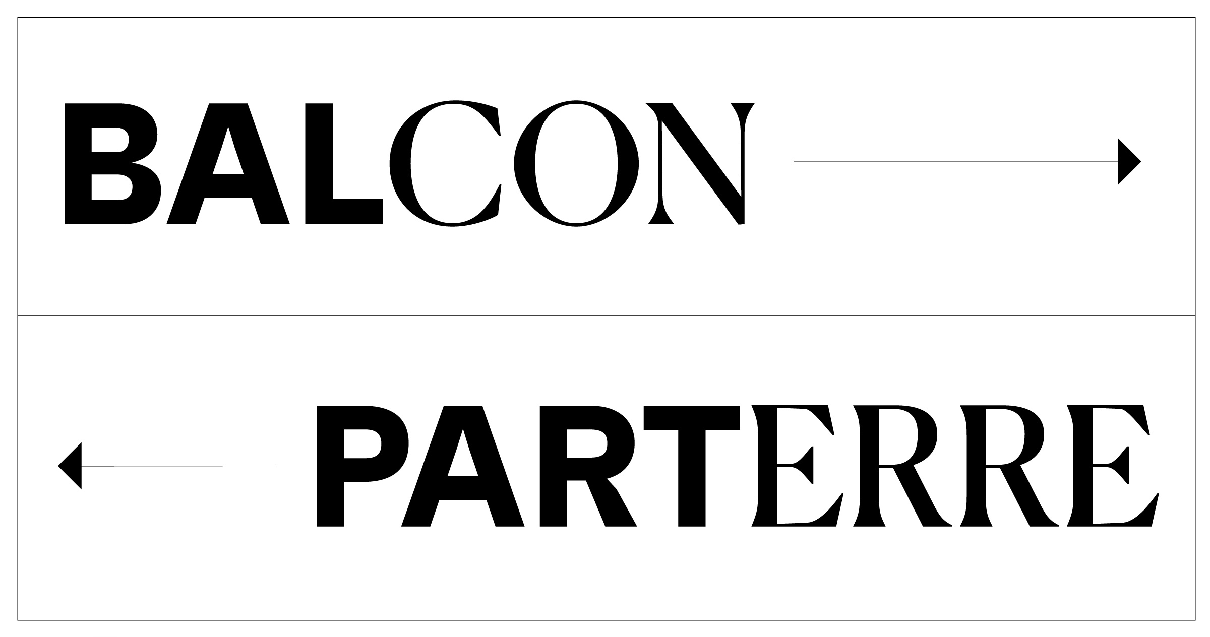
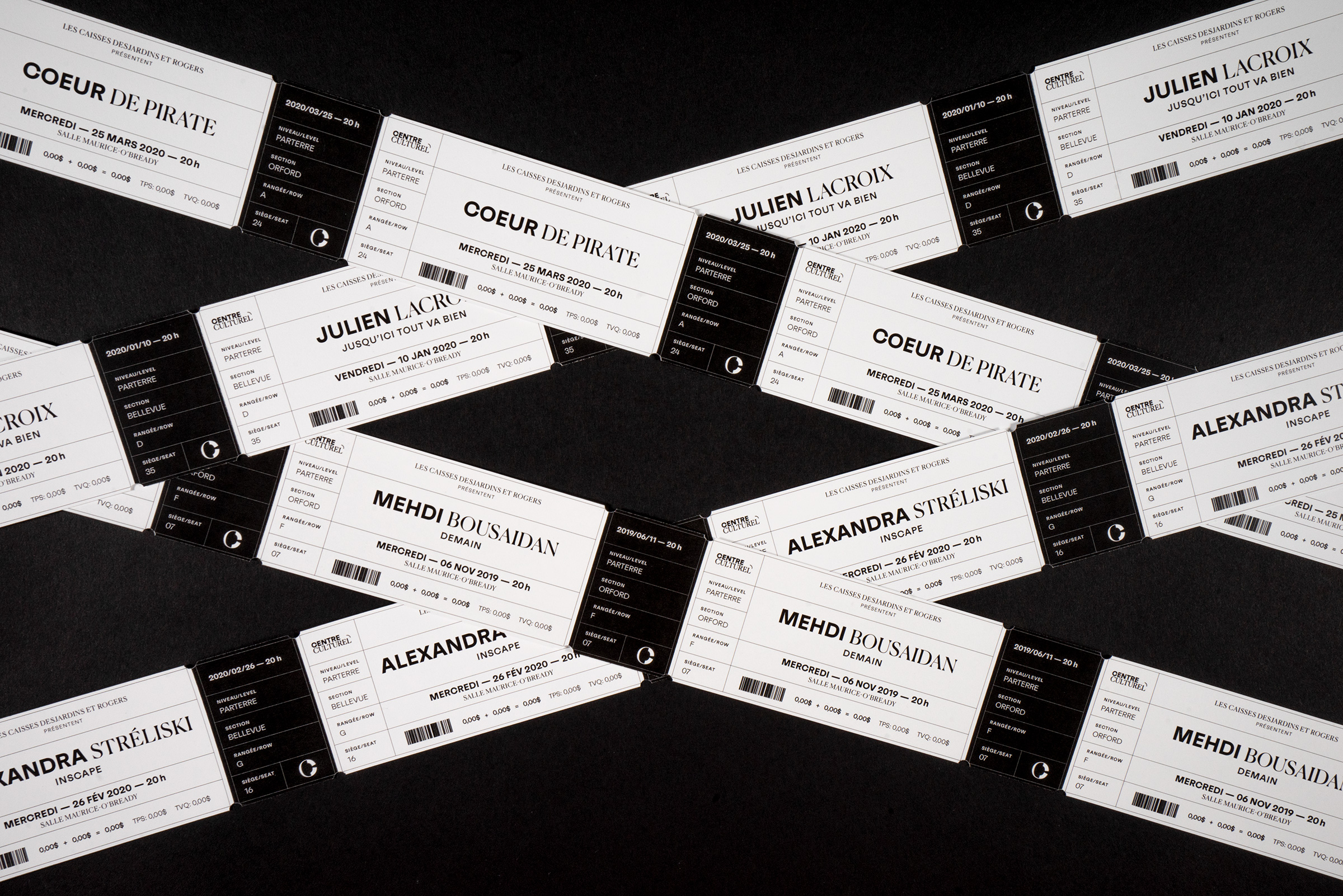
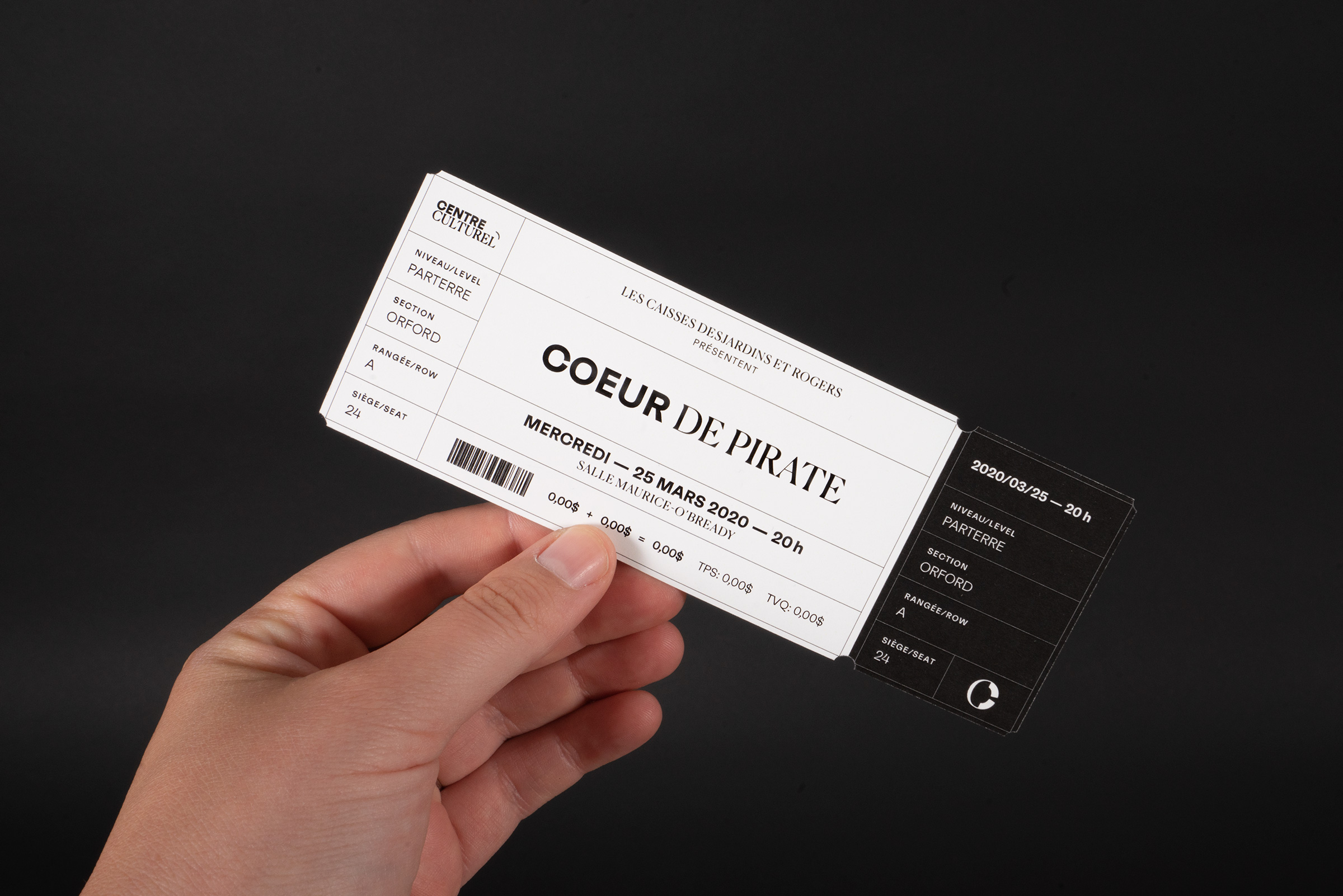
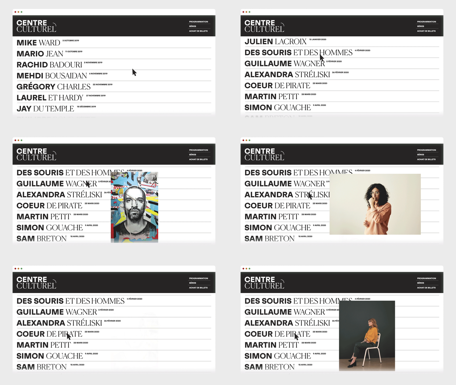
To take the Cultural Center to continue its mission, we have developed a new tailored brand identity. The main guideline of this identity is the game that represents the dialogue between creator and audience. As an evolution of the old logo, a graphic system based on a typographic game has been developed. The mix of the two typographies evokes a mix between more bold and colorful works with creations that are rather poetic and with attention to detail. The curved line symbolizes the connection that the cultural center realizes as a performance hall between artists and the public. In communications, this visual identity is rich in meaning and is easily declinable.
To take the Cultural Center to continue its mission, we have developed a new tailored brand identity. The main guideline of this identity is the game that represents the dialogue between creator and audience. As an evolution of the old logo, a graphic system based on a typographic game has been developed. The mix of the two typographies evokes a mix between more bold and colorful works with creations that are rather poetic and with attention to detail. The curved line symbolizes the connection that the cultural center realizes as a performance hall between artists and the public. In communications, this visual identity is rich in meaning and is easily declinable.
To take the Cultural Center to continue its mission, we have developed a new tailored brand identity. The main guideline of this identity is the game that represents the dialogue between creator and audience. As an evolution of the old logo, a graphic system based on a typographic game has been developed. The mix of the two typographies evokes a mix between more bold and colorful works with creations that are rather poetic and with attention to detail. The curved line symbolizes the connection that the cultural center realizes as a performance hall between artists and the public. In communications, this visual identity is rich in meaning and is easily declinable.
To take the Cultural Center to continue its mission, we have developed a new tailored brand identity. The main guideline of this identity is the game that represents the dialogue between creator and audience. As an evolution of the old logo, a graphic system based on a typographic game has been developed. The mix of the two typographies evokes a mix between more bold and colorful works with creations that are rather poetic and with attention to detail. The curved line symbolizes the connection that the cultural center realizes as a performance hall between artists and the public. In communications, this visual identity is rich in meaning and is easily declinable.



Nous créons des projets qui sortent du cadre et collaborons avec des marques ambitieuses, ici comme ailleurs, pour donner vie à des idées audacieuses.
PARLEZ-NOUS DE VOTRE PROJET
INFO@STUDIOMILES.CA
+1 (819) 481-1246
STUDIO
ARCHIVES
SHOP
POLITIQUE DE CONFIDENTIALITÉ
TERMES ET CONDITIONS
® STUDIO MILES / TOUS DROITS RÉSERVÉS